Graphic design
Branding, Packaging & Graphic Design
Project overview
Explore how typography, colour and imagery shape a visual identity across campaigns, product packaging and print design.
- Context
- University coursework · Graphic design
- My role
- Graphic, Brand & Packaging Designer
- Software
- Methods
- Visual identity, Packaging design, Typography, Image composition, Product mockups
My contribution
I designed the LYFT campaign compositions, Daily Dose can graphics, ÖKA chocolate identity and packaging, and the accompanying graphic design studies.
Process
Each brief explores a different use of visual design: LYFT focuses on image composition and large type, while Daily Dose and ÖKA develop identities around product variants.
Posters, wrappers, can mockups, editorial layouts and identity studies connect the work through experiments with typography, colour and visual hierarchy.
Result
A course collection of campaign compositions, packaging concepts and print studies. These are university design concepts rather than commercial client commissions.
LYFT — Water Campaign Concept
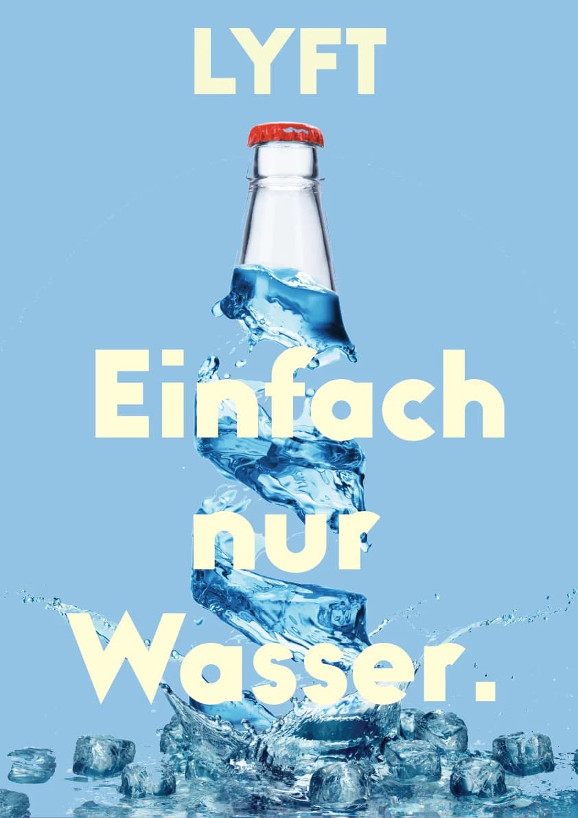
Two advertising-poster variations for a water-brand concept, built around the line "Einfach nur Wasser." A floating bottle, splashing water and oversized type carry the message.
1 of 2
Daily Dose — Drinks Packaging
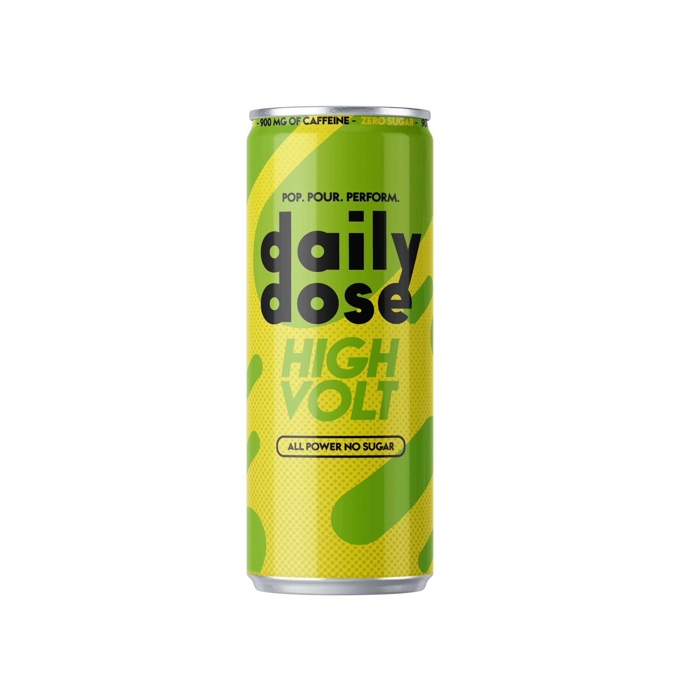
Can-design studies for Daily Dose, including High Volt and Pure Drive variants. Large lettering, lime tones and organic shapes build a shared identity across the product mockups.
1 of 2
Graphic Design Studies
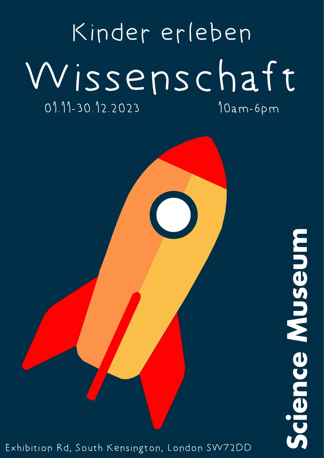
A selection of university graphic-design work: a children’s science poster, a Mister X book cover, a hackathon flyer, an Offener Kanal Lübeck identity concept and further illustration studies.
1 of 6
OKA — Chocolate Branding
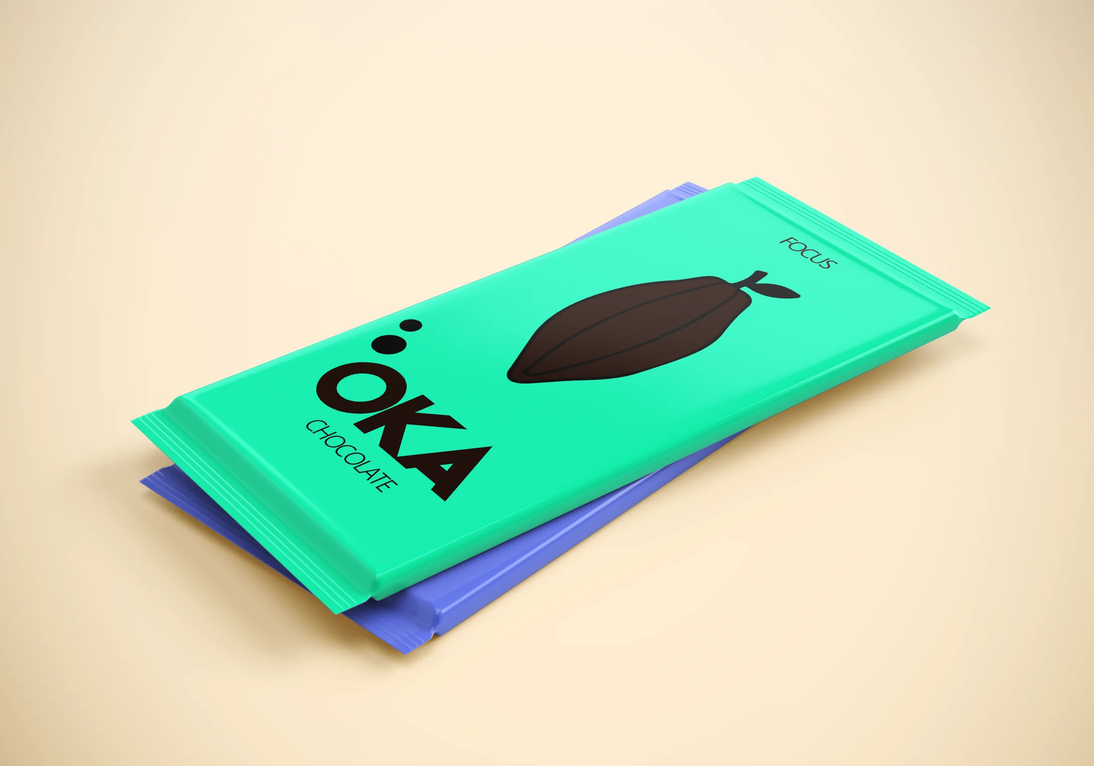
A chocolate-brand concept developed through logo, colour and packaging studies. OKA uses a cocoa-pod symbol and bold colours to give the Focus and Calm variants their own visual identities.
1 of 3